Index

05 · Insurance · Mobile

MetLifeMobileAppRedesign

A ground-up redesign of MetLife's customer app — restructured navigation, simplified claims, and a warmer, calmer visual system to turn a compliance-heavy product into something people actually open.

Client
MetLife
Role
Lead UX/UI Designer
Scope
UX Research · Information Architecture · UI Design · Prototyping
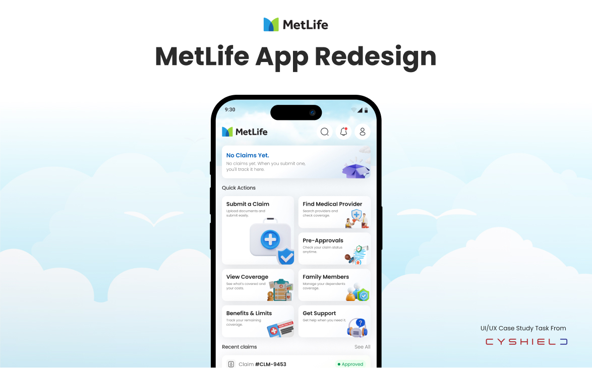
MetLife — Mobile App Redesign — cover image. Rebuilding a policy app around clarity and confidence.

Overview

Redesign the MetLife insurance app to improve usability, navigation, and user engagement — a human-centered, research-informed design process that started with the app's own users telling us, publicly, exactly what was broken.

01 · Project Overview

A human-centered, research-informed redesign.

MetLife's legacy mobile app was built around policy compliance, not around people. Customers only opened it under stress — filing a claim, replacing a card, checking coverage before a clinic visit — and left more confused than when they arrived.

The brief was direct: redesign the MetLife insurance app to improve usability, navigation, and user engagement. The constraint was equally direct — reduce cognitive load without hiding the regulated language the product legally requires.
02 · User Insight Synthesis

Reviews from Google Play, App Store & Trustpilot.

Before touching a wireframe I pulled every public review of the existing app across Google Play, the App Store and Trustpilot. The ratings alone told the story — Google 1.7, Trustpilot 1.3, App Store 1.4 — but the review text told me exactly where the app was breaking.

Floyd Miles · Google · ★★

"Very bad app can't make a claim." — Feb 11, 2023

Dianne Russell · Google · ★★

"Terrible app and very bad network." — Oct 31, 2022

Guy Hawkins · Google · ★★

"Nothing found when I search for medical provider." — May 29, 2025

Esther Howard · Trustpilot · ★

"My family members don't appear on it, neither my benefits nor View My Health Card." — Mar 6, 2026

Theresa Webb · Trustpilot · ★

"Worse user experience ever, hire a UI/UX team!" — Feb 28, 2018

Leslie Alexander · Trustpilot · ★★

"Locate a Medical Provider service (Online & Offline) is not working at all." — May 9, 2014

Cody Fisher · App Store · ★

"Finding service provider is not working." — Jul 14, 2025

Darlene Robertson · App Store · ★★

"The application is very hard to navigate." — Oct 25, 2023

Robert Fox · App Store · ★★

"The application doesn't function properly." — Apr 28, 2022

  • Google Play · 1.7 / 5Predominantly two-star reviews citing crashes, missing family members, and claims that couldn't be submitted.
  • Trustpilot · 1.3 / 5The lowest score of the three surfaces — users describing the experience as untrustworthy end-to-end.
  • App Store · 1.4 / 5Repeated complaints about broken provider search and an app that "doesn't function properly."

Around half of users showed signs of confusion in navigation and information architecture, often struggling to locate key features like claims and provider search.

03 · Pain → Solution

Clustering the reviews into a shipping list.

I clustered the review data into recurring pain points, then paired each cluster with a concrete design response. This table became the north star for every screen that followed.

Pain pointSolution
No filtering or poor filtering when searchingAdd a dedicated filter bar on results: Provider, Specialty, Location.
Pre-approvals disappearUse a clear IA: "Pre-approvals" as a top-level section with statuses (Draft, Submitted, In review, Approved, Rejected, Expired).
Confusing navigationRedesign the global IA into 4–5 main tabs max.
No proper claim trackingGive status for the claim and label it with the current status.
No reliable notificationsProvide a notification for the user when the claim status changes.
Hard to find the providersMake "Find a provider" a primary entry point.

04 · Heuristic Evaluation

Auditing the old app against Nielsen's ten.

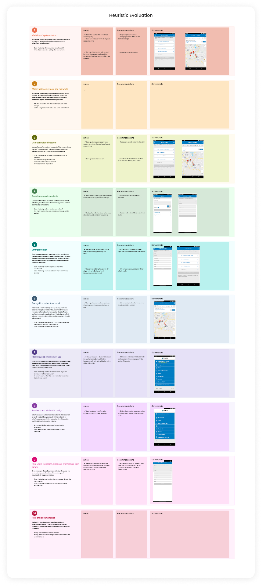
Before touching a wireframe I ran the existing app through a full Nielsen heuristic evaluation. Ten heuristics, screen by screen, issue and recommendation for each. The pattern that emerged wasn't ten separate problems — it was one problem repeated: the app never told the user where they were, what had happened, or what to do next.

Insight 01

Visibility of system status — CTAs appeared without success or error feedback, and the map showed pins with no indication of how many providers were nearby.

Insight 02

User control and freedom — the claim form had no draft or save-and-exit; abandoning mid-flow lost everything the user typed.

Insight 03

Consistency and standards — native toggles and platform patterns were replaced with custom controls that read as decorative, not functional.

Insight 04

Error prevention — input fields lacked hints and examples, so users only discovered the required format after submitting and failing.

Insight 05

Recognition rather than recall — map pins carried no labels, forcing users to tap each one to remember which was which.

Insight 06

Help users recognize and recover from errors — rejection messages were plain-text codes with no explanation of what went wrong or how to fix it.

Nielsen's ten heuristics — issues, recommendations and screenshots from the old MetLife app.

05 · User Research

Who am I designing for? And where do I lose them?

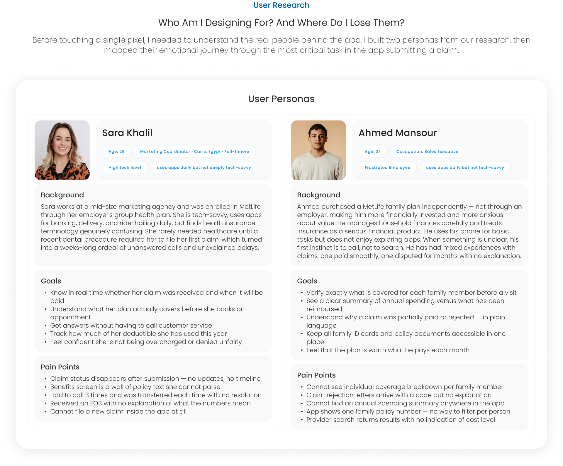
Before touching a single pixel I needed to understand the real people behind the app. Two personas came out of the research — very different profiles, but a shared moment of failure at exactly the same step in the journey.

Sara Khalil · 29 · Marketing Coordinator

Tech-savvy, uses banking and delivery apps daily, but health-insurance terminology confuses her. Filed her first claim after a dental procedure — and it turned into a weeks-long ordeal of unanswered calls and unexplained delays.

Ahmed Mansour · 37 · Sales Executive

Bought a MetLife family plan independently, so he's financially invested and anxious about value. Not app-fluent; his first instinct is to call, not to search. Needs to see per-family-member coverage and understand exactly why a claim was partially paid.

Two personas built from the research: Sara Khalil and Ahmed Mansour.

06 · Key Insights

Where the app breaks trust.

Synthesising the interviews, diary studies and support-log review, the same handful of failures kept surfacing — grouped into a wall of post-its that later drove every design decision.

Insight 01

Poor information architecture and task prioritisation — the primary jobs are buried under secondary content.

Insight 02

No confirmation after submission — the user is left wondering whether the claim was received at all.

Insight 03

Lack of transparency is the core problem — coverage is opaque before the visit, and reimbursement is opaque after.

Insight 04

Rejections arrive as codes, with no explanation and no path to appeal.

Insight 05

After filing a claim, the user receives zero feedback — no reference number, no status, no estimated timeline.

Insight 06

Users want simple explanations and inline tooltips, not paragraphs of policy language.

Clustered insight wall — every recurring failure surfaced as a post-it.

07 · User Journey

Mapping the emotional arc of a claim.

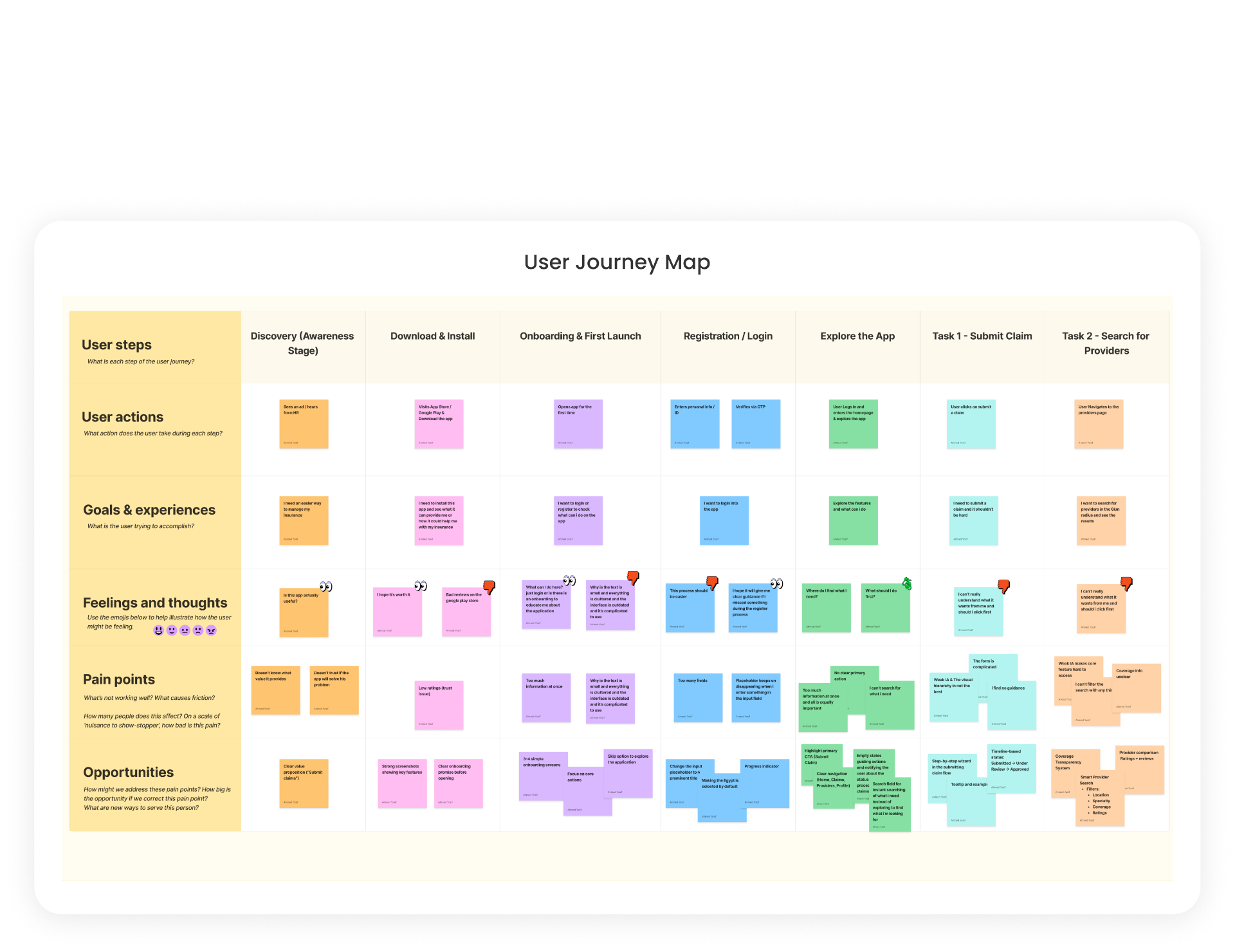
I mapped the end-to-end journey across seven stages — Discovery, Download & Install, Onboarding, Registration, Explore, Submit Claim, Search Providers — and layered feelings, pain points and opportunities on top. The dips were consistent: onboarding felt cluttered, registration overwhelmed with fields, and the claim form gave no sense of progress or completion.

StagePain pointOpportunity
OnboardingToo much text, cluttered layout, complicated navigation.3–4 simple onboarding screens with strong visuals and a skip option.
RegistrationToo many fields at once, no clear primary action.Progress indicator, prominent CTA, Egypt selected by default.
ExploreWeak IA, unclear where to start, no search.Clear four-tab navigation and a persistent search field.
Submit claimThe form is complicated; users don't know what to click first.Step-by-step wizard with a visible timeline: Submitted → Under review → Approved.
Find providersCan't filter, no cost or coverage indicator on results.Smart provider search with filters for location, specialty, coverage and ratings.
End-to-end journey map — actions, feelings, pain points and opportunities across seven stages.

08 · Impact / Effort

Prioritising what to build first.

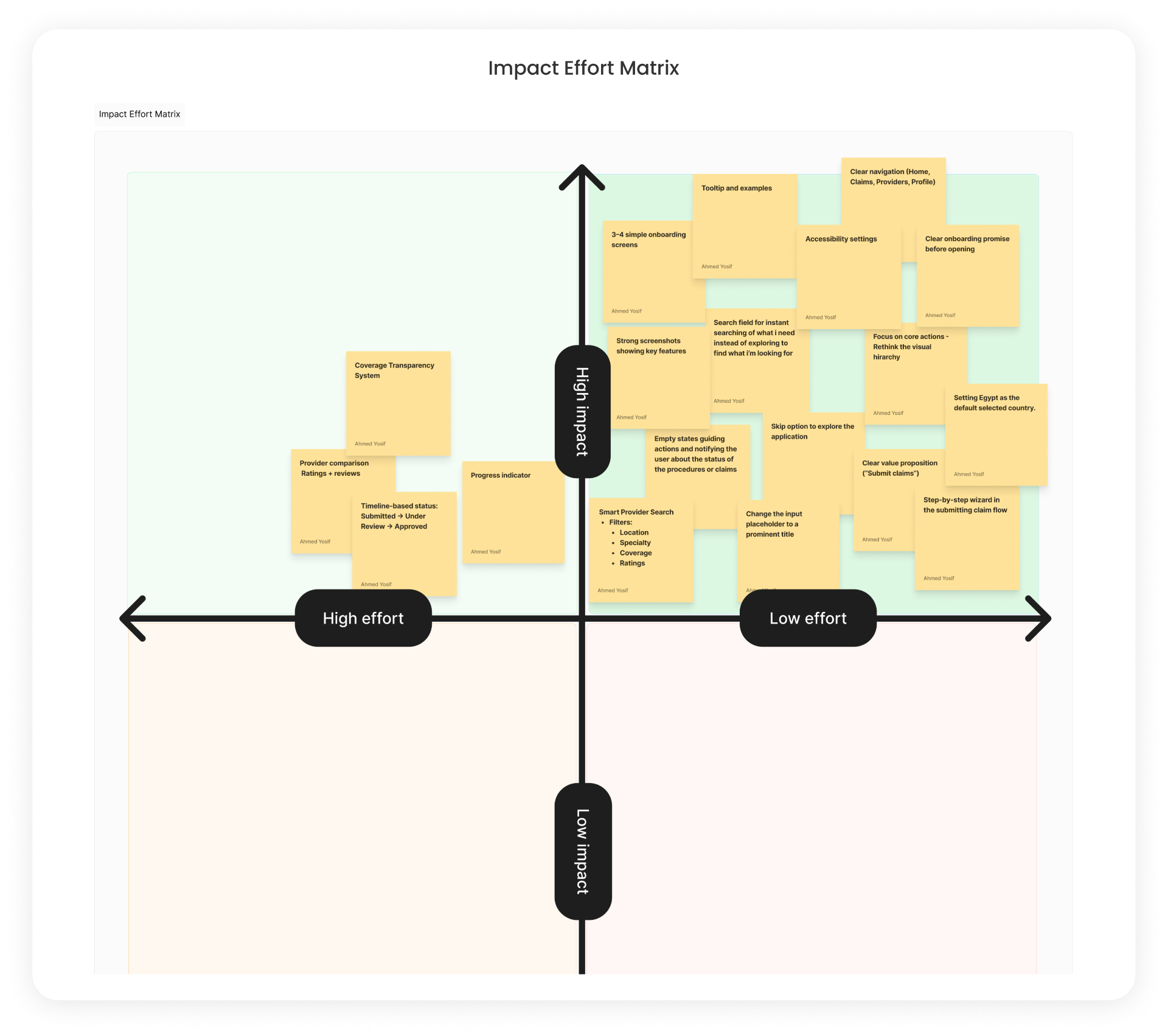
Every opportunity from the journey map went onto an impact–effort matrix. The top-right quadrant — high impact, low effort — became the shipping list for v1. Bigger structural bets like the full coverage transparency system moved to a v2 roadmap.

  • Ship firstClear four-tab navigation, step-by-step claim wizard, onboarding rewrite, progress indicator, tooltips and examples, Egypt as default country.
  • Ship nextSmart provider search with filters, timeline-based claim status, empty states that guide the next action.
  • RoadmapFull coverage transparency system and provider comparison with ratings and reviews.
Impact / effort matrix — high-impact, low-effort moves became the v1 shipping list.

09 · User Flow & IA

From seventeen tabs to four.

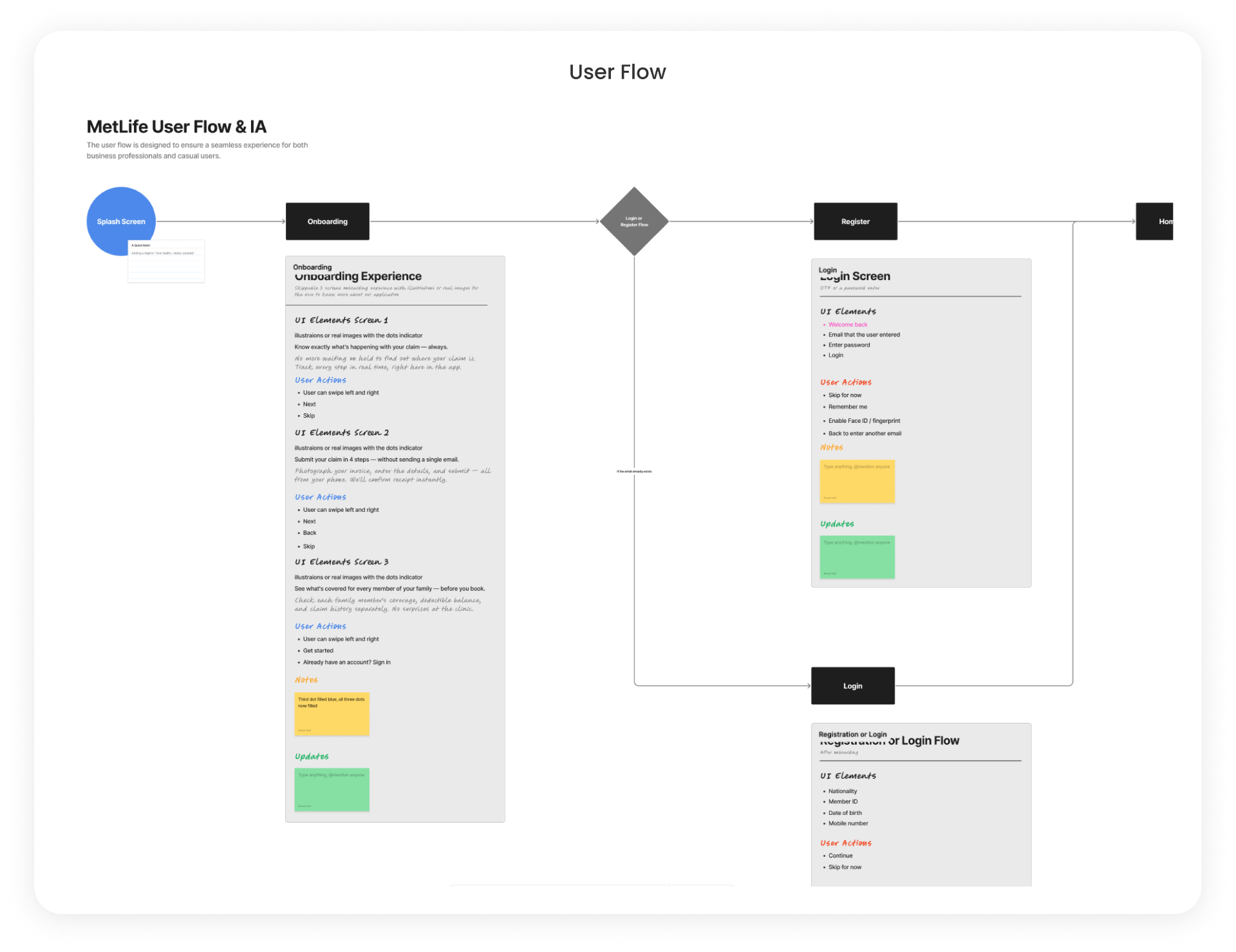
Card sorts collapsed the old menu into four primary destinations — Home, My Claims, Providers, Settings. The flow itself was redrawn so every regulated step had a single unambiguous next action: Splash → Onboarding → Login or Register → Home, with contextual entries into the claim wizard and provider map from the home screen instead of buried settings pages.

User flow & information architecture — Splash → Onboarding → Login or Register → Home.

10 · Wireframes

Low-fidelity structure before pixels.

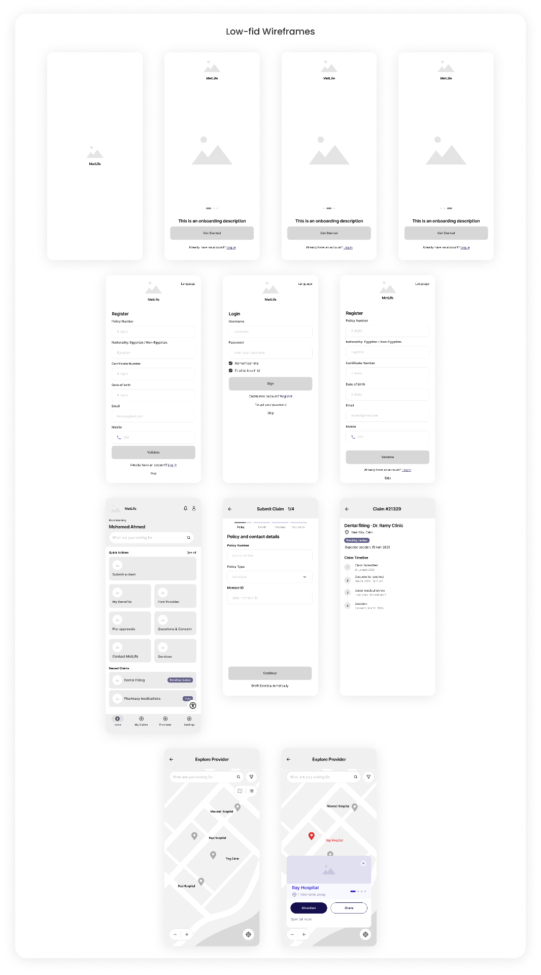
Greyscale wireframes locked the layout of every screen — onboarding, register, login, home, claim wizard, claim detail and provider map — before any color, type or motion decisions were made.

Low-fidelity wireframes for every core screen in the redesigned app.

11 · Style Guide

A quieter, more human visual system.

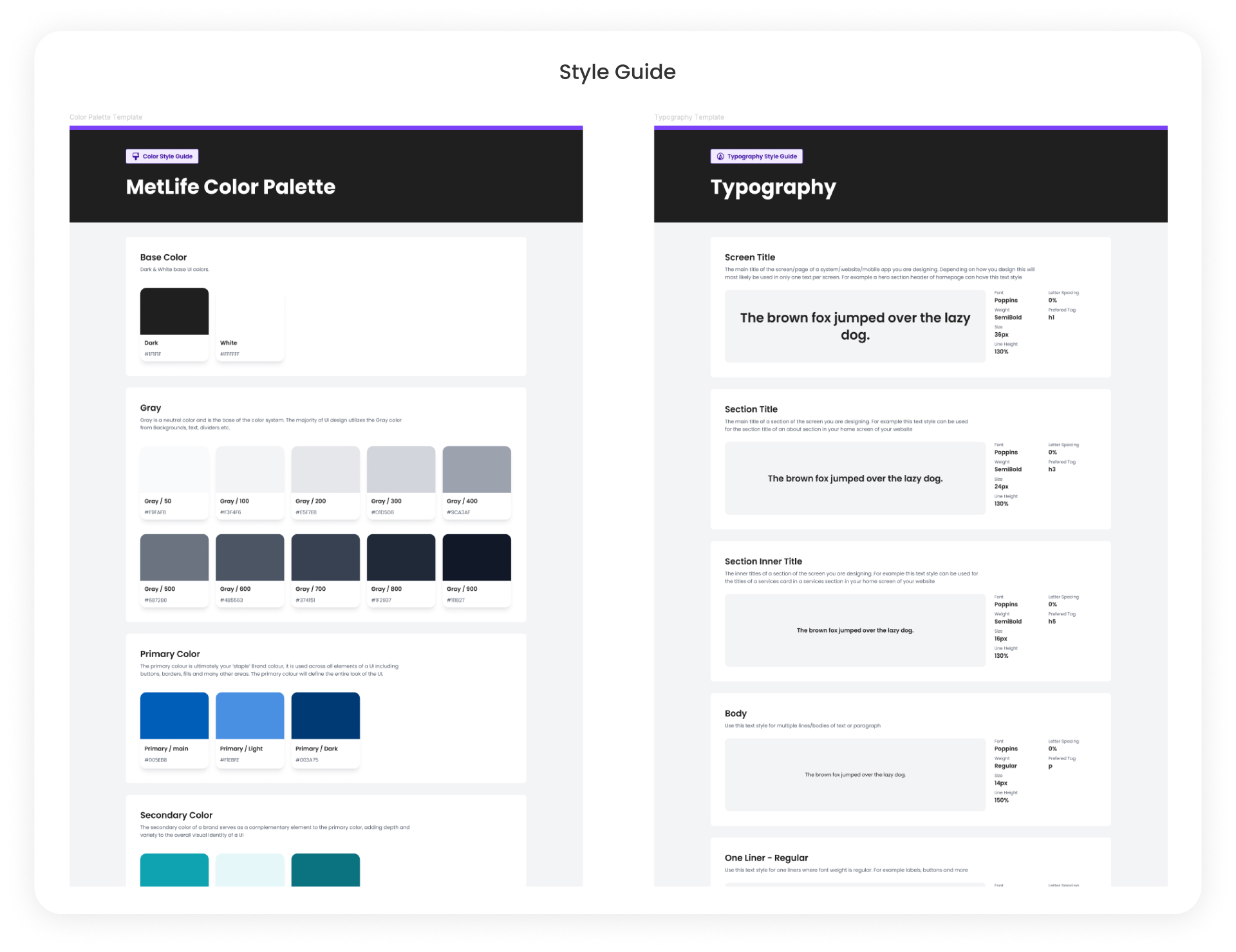
The visual language moved from dense corporate blue-on-white to a calmer neutral surface with a focused MetLife-blue accent. Poppins across a disciplined type ramp — 36 / 24 / 16 / 14 — with generous line-height so long-form policy content stays readable on a 6-inch screen.

  • BaseDark #1F1F1F, White #FFFFFF, and a nine-step neutral gray scale for surfaces, text and dividers.
  • PrimaryMetLife blue — Main #005EB8, Light #F1EBFE, Dark #003A75 — used sparingly for primary actions and status.
  • TypographyPoppins. Screen title 36 / SemiBold, section title 24 / SemiBold, inner title 16 / SemiBold, body 14 / Regular at 150% line-height.
MetLife style guide — color palette and typographic ramp built on Poppins.

12 · Final UI

Clarity at every step.

The redesigned app opens on a calm home screen with a friendly empty state and a Quick Actions grid that surfaces the six jobs people actually come here to do — Submit a Claim, Find Medical Provider, Pre-Approvals, View Coverage, Family Members, Benefits & Limits.

The claim flow became a four-step wizard with a persistent progress indicator, a clear "Before you start" checklist, and a success screen that shows the claim number the moment it's submitted — closing the feedback loop that broke trust in the old app.

Provider search became a map-first experience with pins that carry names, filters for specialty and coverage, and an inline card that says immediately whether the provider is fully or partially covered under the user's plan.

Insurance is bought once and read at the worst possible moment. Design has to meet that moment.

Final screens

10 · tap a screen

Case study

MetLife — Mobile App Redesign — MetLife App — Case Study Overview. Restructured navigation from seventeen tabs to four, a simplified claims flow, and a warmer visual system rebuilt around clarity and confidence.

MetLife

MetLife App — Case Study Overview

Restructured navigation from seventeen tabs to four, a simplified claims flow, and a warmer visual system rebuilt around clarity and confidence.

Outcome

The redesigned app shipped with a restructured four-tab IA, a step-by-step claim wizard with timeline-based status, a map-first provider search with coverage indicators, and a warmer visual system that MetLife's regional teams now use as the reference for other markets.

Global reach

Shipped with teams across seven countries.

  • Egypt flagEgypt
  • Saudi Arabia flagSaudi Arabia
  • UAE flagUAE
  • Bahrain flagBahrain
  • Belgium flagBelgium
  • Türkiye flagTürkiye
  • Germany flagGermany