Index

06 · Banking · Mobile

BanqueMisrPersonalFinanceExperience

Competitive audit, feature matrix, personas and a full mobile design system led to a redesigned experience that turns raw transactions into meaningful budgets, goals and insights.

Client
Banque Misr
Role
Product Designer
Scope
Research · Competitive Analysis · UI Design · Design System
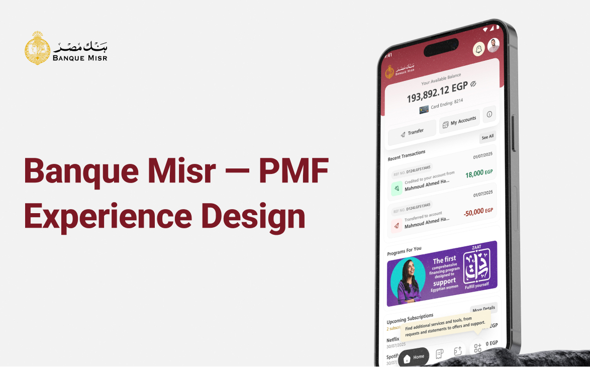
Banque Misr — Personal Finance Experience — cover image. A personal finance management layer inside a national bank.

Overview

Banque Misr wanted to move beyond being a transaction ledger and become a personal financial companion — helping customers budget, save, and understand where their money actually goes.

01 · Research Techniques

A four-phase process, made explicit.

Rather than jumping straight into screens, the work was scoped as an end-to-end product process: Research, Define, Ideation and Prototype — each phase with its own techniques and deliverables.

Early insight framed the whole product: Banque Misr already runs multiple SME programs, and women account for roughly 24% of the MSME client base — a signal to personalise the mobile app with programs like ZAAT for female users, alongside a clear focus on youth.

  • ResearchCompetitive analysis and user personas to map opportunity space.
  • DefineRequirement gathering and How-Might-We framing to sharpen the problem.
  • IdeationUser flows, wireframes and moodboards to explore direction.
  • PrototypeDesign system, tokens and clickable prototypes with micro-interactions.
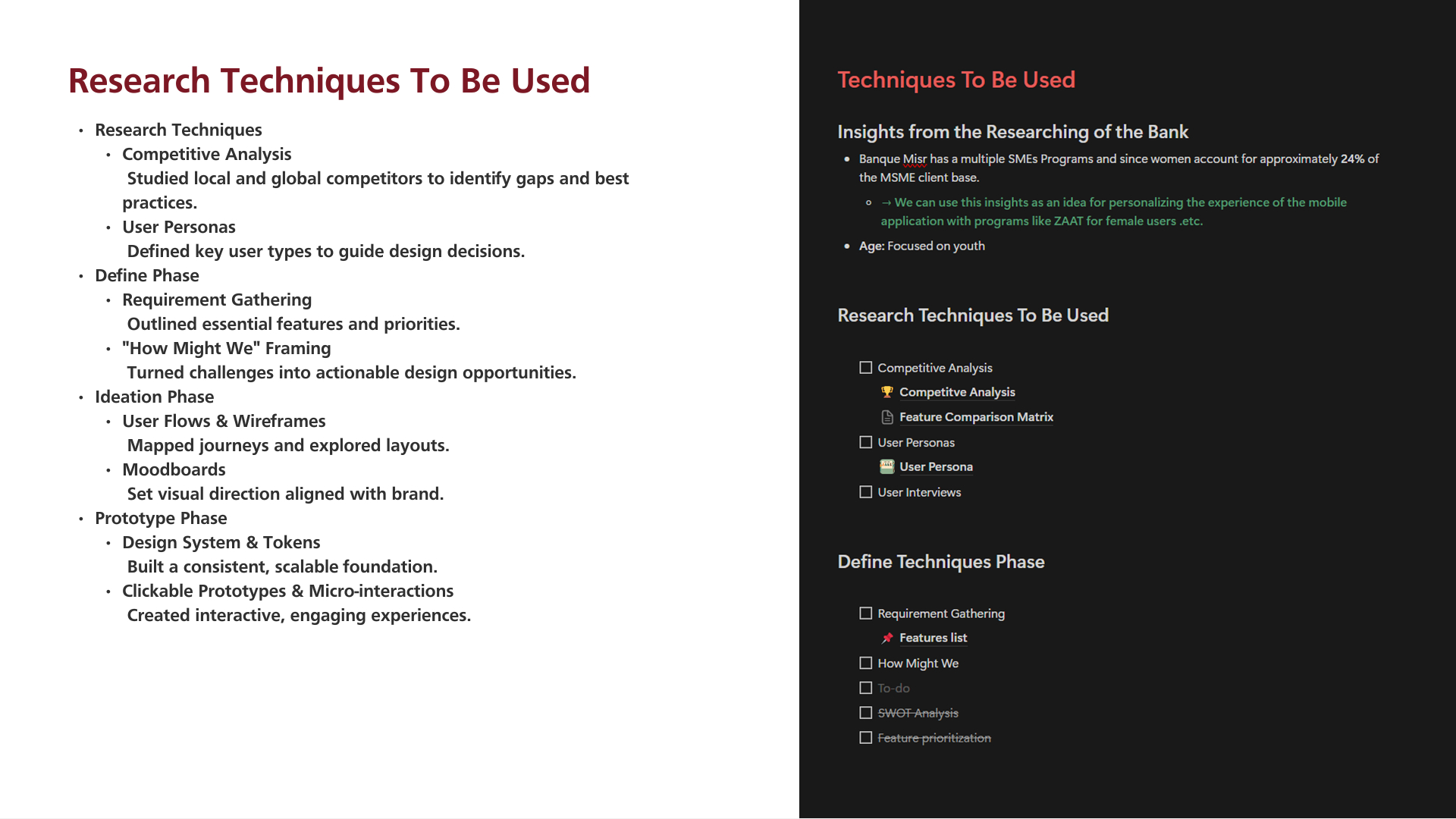
Techniques to be used — insights from researching the bank plus the full four-phase toolkit.

02 · Competitive Analysis

Benchmarking four regional and global players.

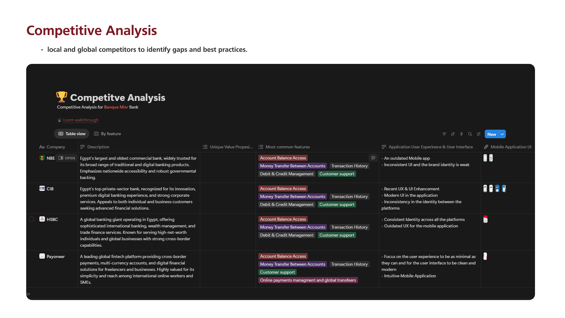
NBE, CIB, HSBC and Payoneer were audited against the same lens: value proposition, most common features, and the state of their mobile UX and UI.

The pattern was consistent — the incumbents ship the transactional features, but their apps feel outdated and inconsistent. Payoneer was the outlier: a minimal, modern experience focused on the user, not the ledger.

Competitive Analysis for Banque Misr Bank — companies, descriptions, common features and UX/UI notes.

03 · Feature Comparison Matrix

Where the whitespace actually is.

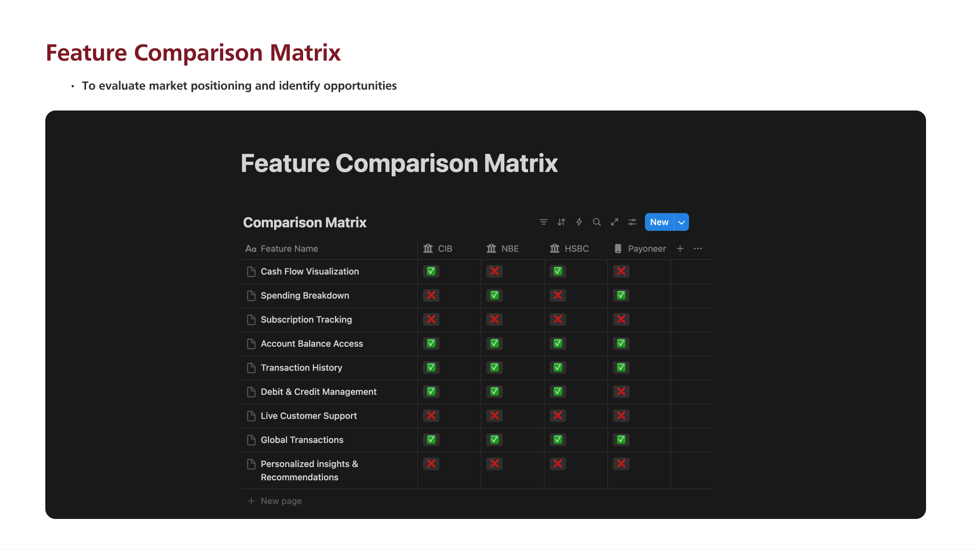
A binary matrix across the top nine PFM capabilities made the gap unmissable: Cash Flow Visualisation, Spending Breakdown, Subscription Tracking, Live Customer Support and Personalised Insights & Recommendations were either missing or half-implemented across every competitor.

That gap became the shortlist of ‘must-have’ features for the redesigned mobile app.

Feature comparison across CIB, NBE, HSBC and Payoneer — used to evaluate market positioning and identify opportunities.

04 · User Personas

Designing for Adam.

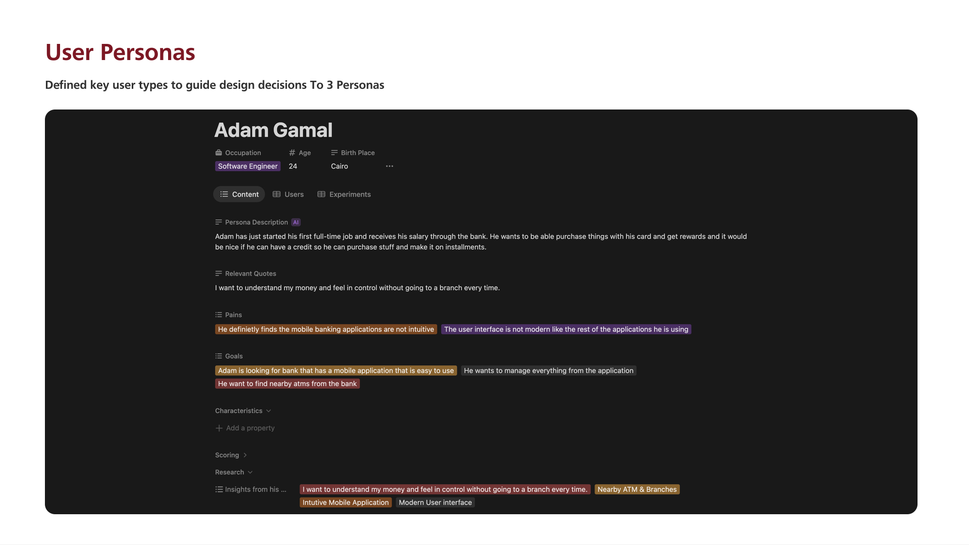
Three personas guided the work; Adam Gamal — a 24-year-old software engineer in Cairo receiving his first full-time salary — carried the most weight.

Adam wants a card he can spend with, rewards that feel worth it, and the option to buy in installments without walking into a branch. His pains map directly to the product bets: an intuitive mobile app, a modern UI, nearby ATMs and true feeling of control.

Adam Gamal — persona description, quotes, pains, goals and the insights that fed the feature list.

05 · Feature List & Requirements

From user stories to a shipped shortlist.

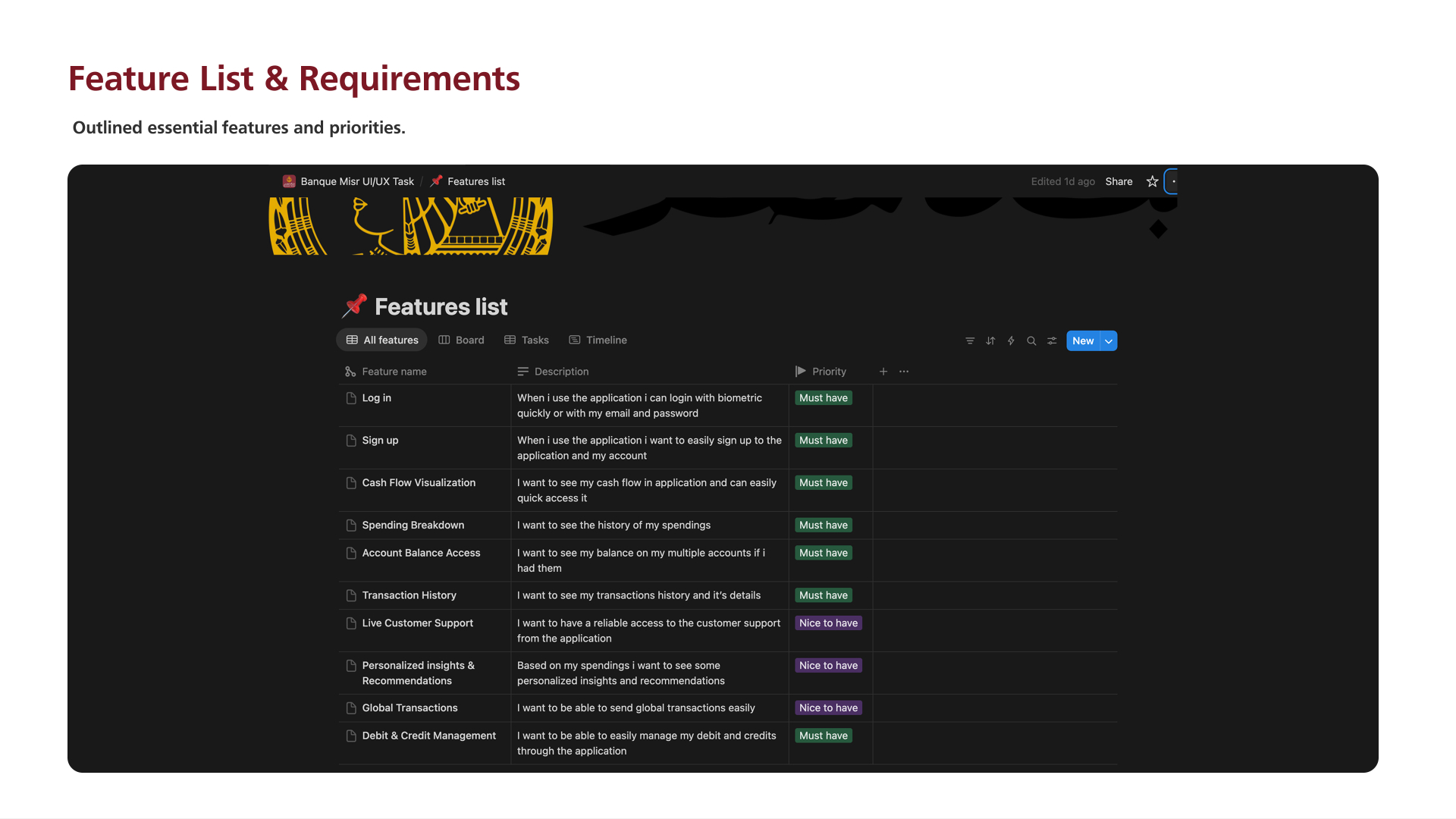
Every feature was written as a first-person user story with an explicit priority: biometric log-in, sign-up, cash flow visualisation, spending breakdown, account balance access, transaction history and debit & credit management landed as Must-haves; live support, personalised insights and global transactions as Nice-to-haves.

This shortlist became the contract between design, product and engineering — nothing shipped without a matching user need.

Features list with descriptions and priority tags — the source of truth for the release scope.

06 · Ideation — Flows & Wireframes

Paper first, pixels second.

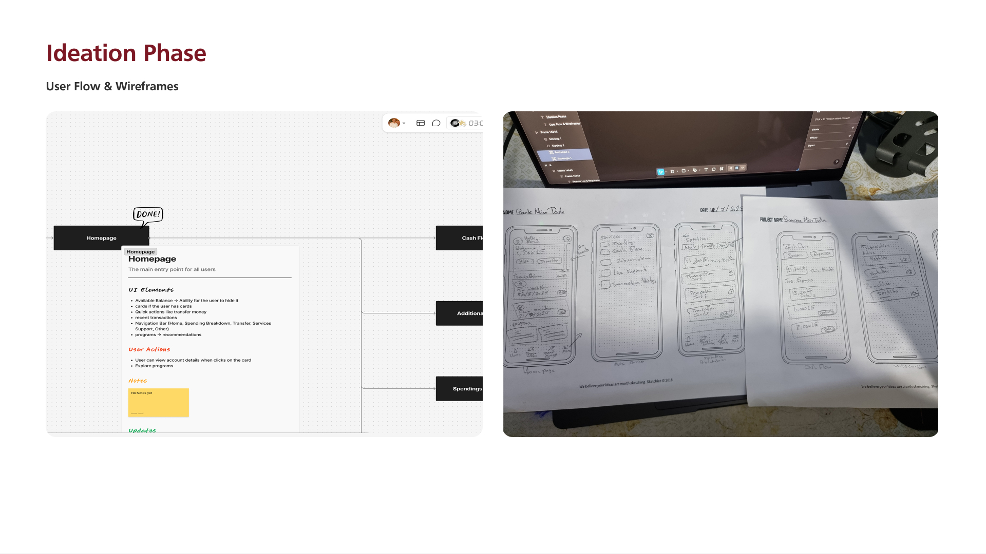
Each screen started as a digital flow node (with UI Elements, User Actions and Notes) then moved to hand-sketched wireframes on paper — Cash Flow, Spendings, Subscriptions, Transaction History — to explore layout options quickly before locking anything to a grid.

Only after the low-fi work agreed did the flows move into Figma for high-fidelity design.

Homepage flow node and paper wireframes for the core screens.

07 · Design System & Tokens

A deep-red identity, engineered.

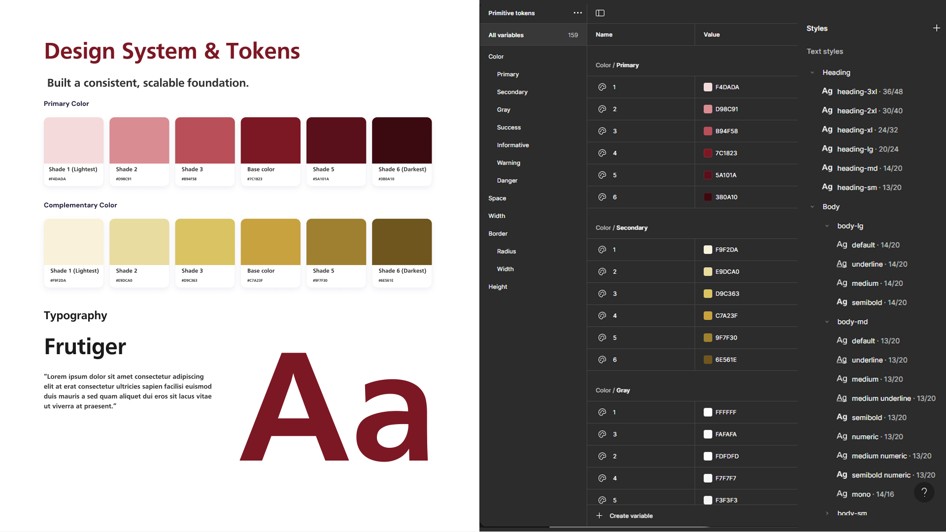
The visual system leans into Banque Misr's heritage red as a functional accent, paired with Frutiger for warmth and clarity in Arabic and Latin.

159 primitive tokens cover primary and complementary colours (each in six shades), gray, success, informative, warning and danger — plus a full text-style ramp from heading-3xl down to body-sm, all wired as reusable Figma styles.

PFM only works when the numbers turn into a sentence the customer can act on.

Primary red and complementary gold ramps, Frutiger typography and 159 primitive tokens in the Figma library.

Screens

01 · click to expand

Final screens

08 · tap a screen

Outcome

A shipped mobile experience with categorized spending, budgets, goals and insights — built on a design system the internal team continues to extend.

Global reach

Shipped with teams across seven countries.

  • Egypt flagEgypt
  • Saudi Arabia flagSaudi Arabia
  • UAE flagUAE
  • Bahrain flagBahrain
  • Belgium flagBelgium
  • Türkiye flagTürkiye
  • Germany flagGermany