Index

07 · E-commerce · Mobile

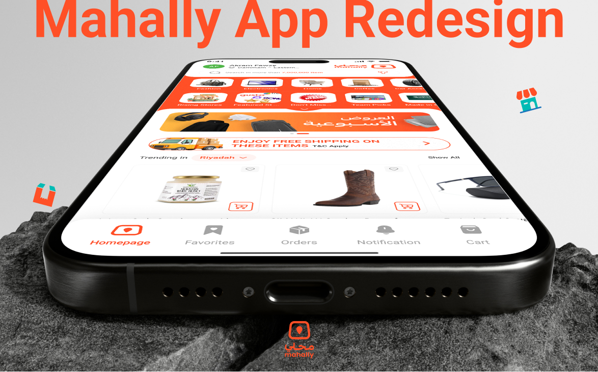
MahallyE-commerceAppRedesign

A screen-by-screen usability audit surfaced dozens of friction points. The redesign rebuilt the homepage, category, product and checkout screens around a cleaner grid and a warmer brand voice.

Client
Mahally
Role
Product Designer
Scope
Heuristic Audit · Usability Testing · UI Design
Mahally — E-commerce App Redesign — cover image. Turning a cluttered marketplace into a shoppable experience.

Overview

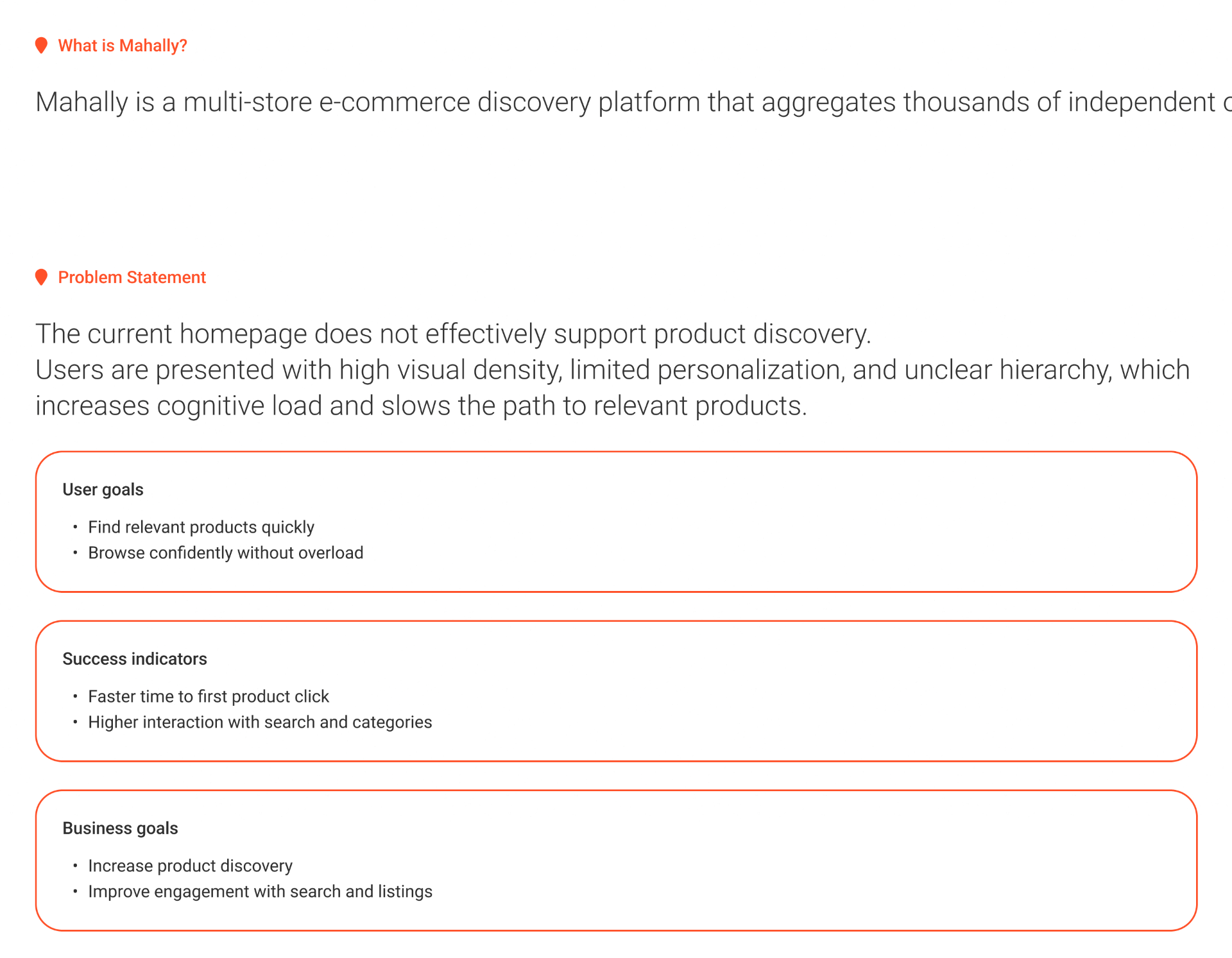
Mahally is a multi-store e-commerce discovery platform that aggregates thousands of independent shops in one app. The original homepage worked — but high visual density, limited personalisation and unclear hierarchy pushed cognitive load up and the path to a first product click down.

01 · Project Overview

Improving product discovery in a multi-store marketplace.

Mahally aggregates thousands of independent shops in a single app. On the current homepage users are greeted with high density, weak hierarchy and little personalisation — so finding a relevant product takes longer than it should.

User goals

Find relevant products quickly. Browse confidently without overload.

Success indicators

Faster time to first product click. Higher interaction with search and categories.

Business goals

Increase product discovery. Improve engagement with search and listings.
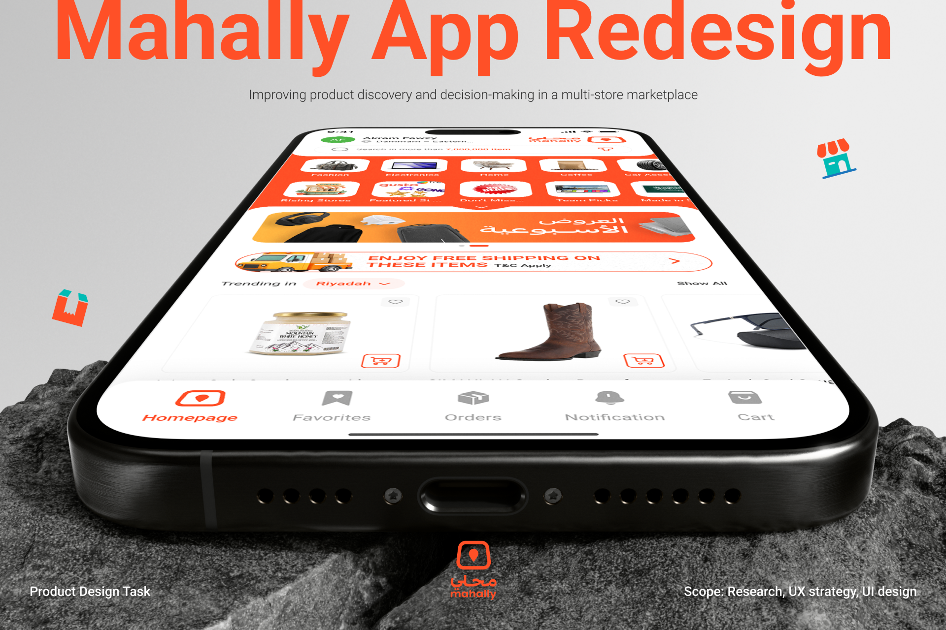
Mahally App Redesign — improving product discovery and decision-making in a multi-store marketplace.

02 · Problem Statement

The current homepage does not effectively support product discovery.

Users are presented with high visual density, limited personalisation, and unclear hierarchy — which increases cognitive load and slows the path to relevant products.

What is Mahally, the problem statement, and the user, success and business goals framed side by side.

03 · Discovery Phase

Fast, high-impact research to understand the challenges.

The Double Diamond kicked off with a Discovery phase focused on cheap, fast methods: a UX heuristic evaluation of the current homepage and competitive benchmarking against Amazon, Noon and Temu.

  • UX heuristic evaluationNielsen's ten heuristics applied to the current homepage.
  • Competitive benchmarkingAmazon, Noon and Temu audited on strengths, weaknesses and ideas for Mahally.
Discovery phase — the research methods chosen to move fast without cutting corners.

04 · Heuristic Evaluation

Ten heuristics, screen by screen.

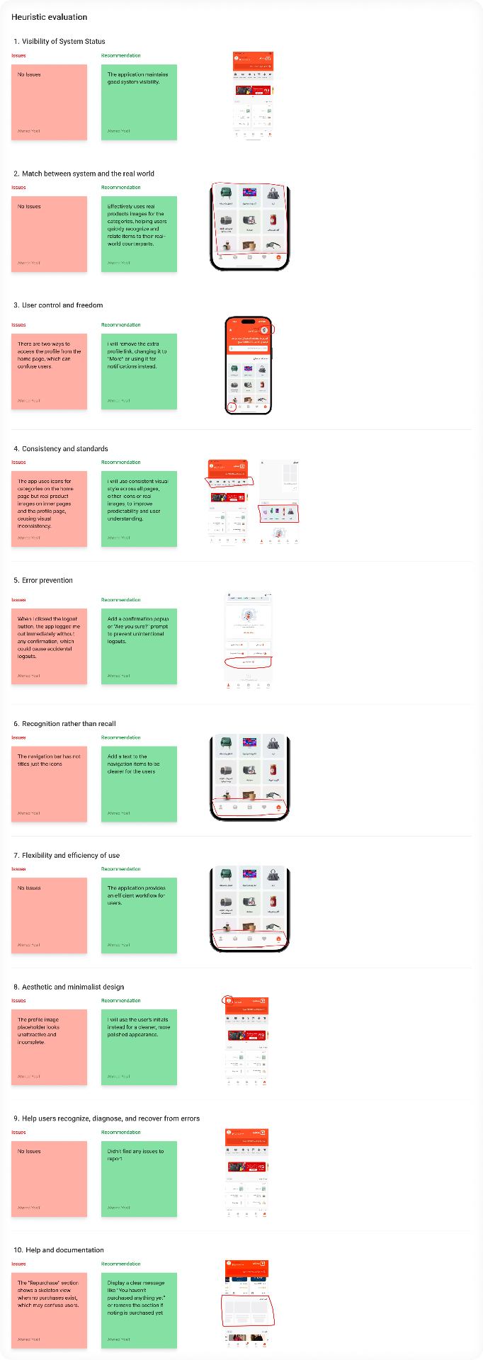
Every homepage and inner screen was walked through Nielsen's ten heuristics. Each finding was written as an Issue with a matching Recommendation, then paired with the exact screenshot it referenced — so engineering and product could see the problem, not just read about it.

The evaluation surfaced concrete wins: add labels to the bottom nav, replace mixed icon/photo product tiles with a consistent style, add a logout confirmation, swap the empty profile placeholder for user initials, and clarify the empty Repurchase state.

Heuristic evaluation — issues and recommendations from Visibility of System Status through Help & Documentation.

05 · Competitive Analysis

Benchmarking against Amazon, Noon and Temu.

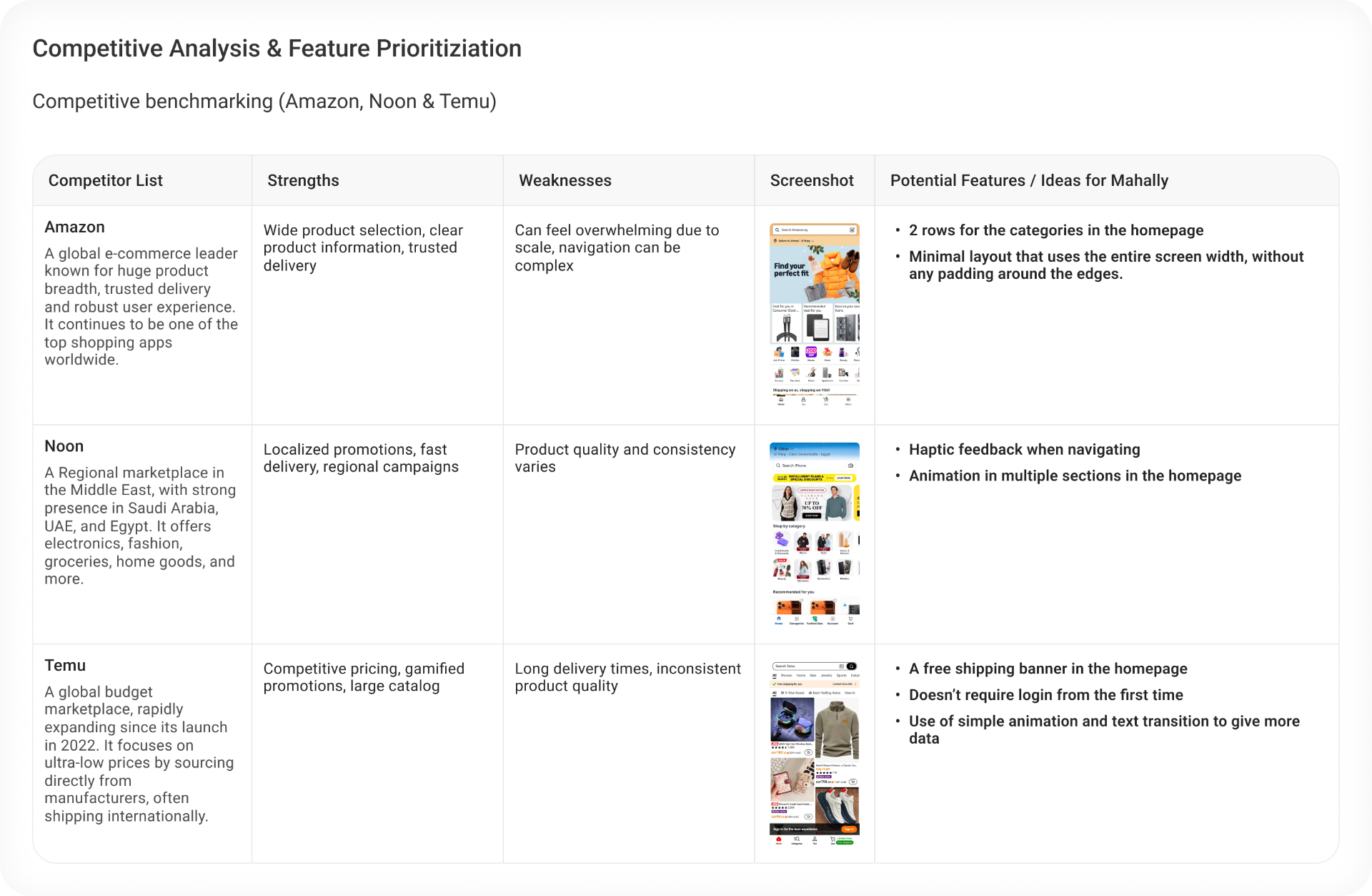
Each competitor was scored on strengths, weaknesses and a screenshot of their homepage — then translated into concrete ideas for Mahally: two rows of categories, a minimal edge-to-edge layout, haptic feedback on navigation, animated banners, a free-shipping banner, and no forced login on first launch.

Competitive analysis and feature prioritisation — Amazon, Noon and Temu mapped to potential features for Mahally.

06 · Additional Findings

The issues the heuristics missed.

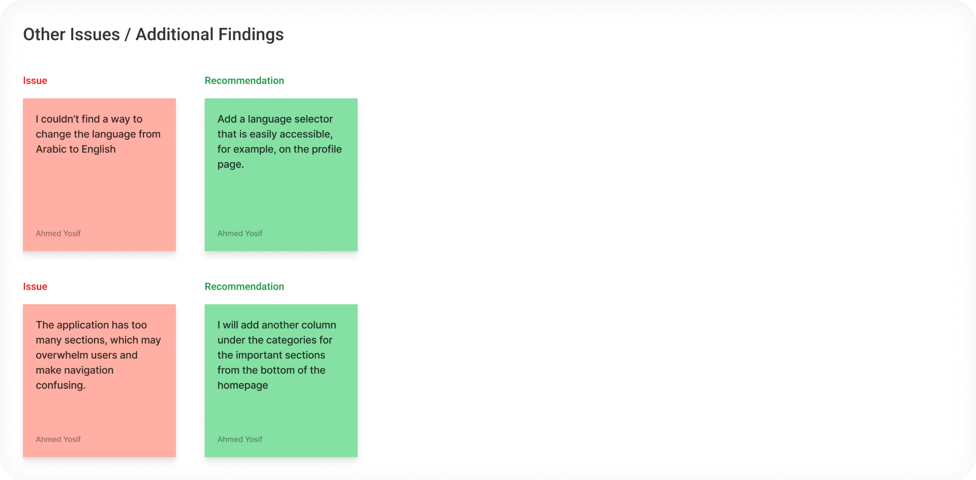
A second sweep captured issues outside the ten heuristics — an inaccessible language switch and an overwhelming number of homepage sections — with recommendations that fed directly into the redesign brief.

Other issues and additional findings — language switching and section overload with proposed fixes.

07 · Define Phase

Structuring insights into actionable user context.

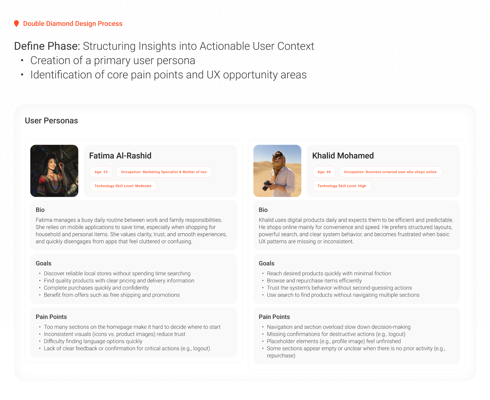
The Define phase turned research into two primary personas — Fatima Al-Rashid and Khalid Mohamed — with explicit bios, goals and pain points that could be pointed at during every design review.

Too many sections on the homepage make it hard to decide where to start.

Primary personas — Fatima and Khalid — with goals and pain points driving the redesign.

08 · Solution & Design Approach

Reducing cognitive load, strengthening consistency.

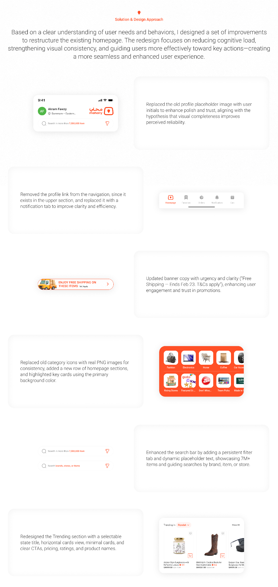
The redesign restructures the homepage to reduce cognitive load, strengthen visual consistency, and guide users more effectively toward key actions.

  • Profile identityReplaced the placeholder image with user initials to raise perceived polish and trust.
  • NavigationRemoved the duplicate Profile link and introduced a Notifications tab in the bottom nav.
  • Promo bannerRewrote copy for urgency and clarity — “Enjoy free shipping on these items”.
  • CategoriesReplaced icons with real PNGs, added a second row, and grounded the block with the primary brand colour.
  • SearchPersistent filter tab plus dynamic placeholder text — “Search in more than 7,000,000 item”.
  • TrendingHorizontal card rail with location selector, ratings, prices and clear CTAs.
Solution & Design Approach — each redesign decision mapped to the research insight that motivated it.

Screens

01 · click to expand

Final screens

01 · tap a screen

Outcome

A redesigned homepage that trades density for hierarchy — a persistent search, a two-row category grid, clearer promotions and a horizontal Trending rail — grounded in a heuristic evaluation, competitive benchmark and two primary personas.

Global reach

Shipped with teams across seven countries.

  • Egypt flagEgypt
  • Saudi Arabia flagSaudi Arabia
  • UAE flagUAE
  • Bahrain flagBahrain
  • Belgium flagBelgium
  • Türkiye flagTürkiye
  • Germany flagGermany