Index

11 · GovTech · Healthcare Analytics

UAEMinistryofHealthPopulationHealthDashboard

A single dashboard for the UAE Ministry of Health that turns national birth, death and mortality data into a clear, filterable view for analysts and executives alike.

Client
UAE Ministry of Health
Role
Product Designer
Scope
UX Research · Information Architecture · Data Viz · UI Design · Design System
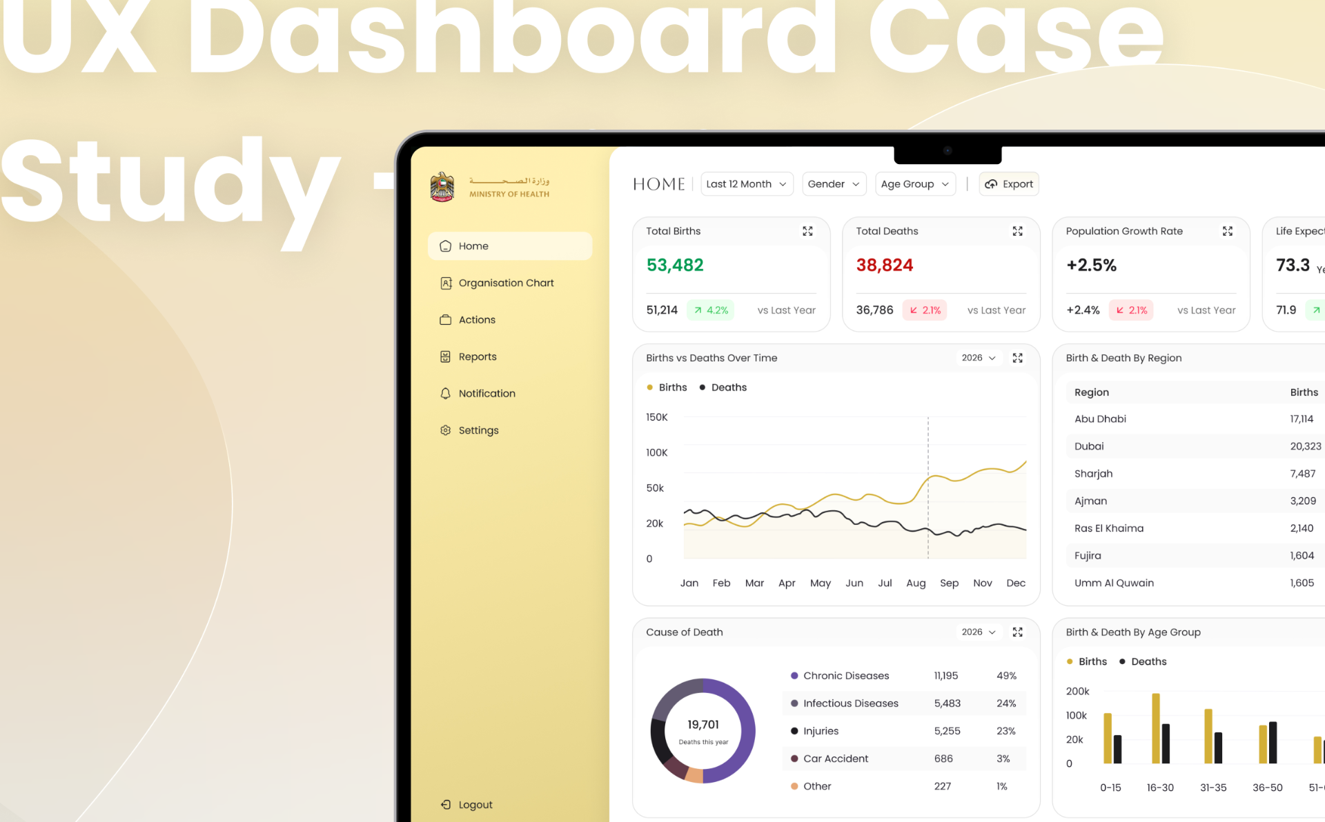
UAE Ministry of Health — Population Health Dashboard — cover image. National health data, decision-ready at a glance.

Overview

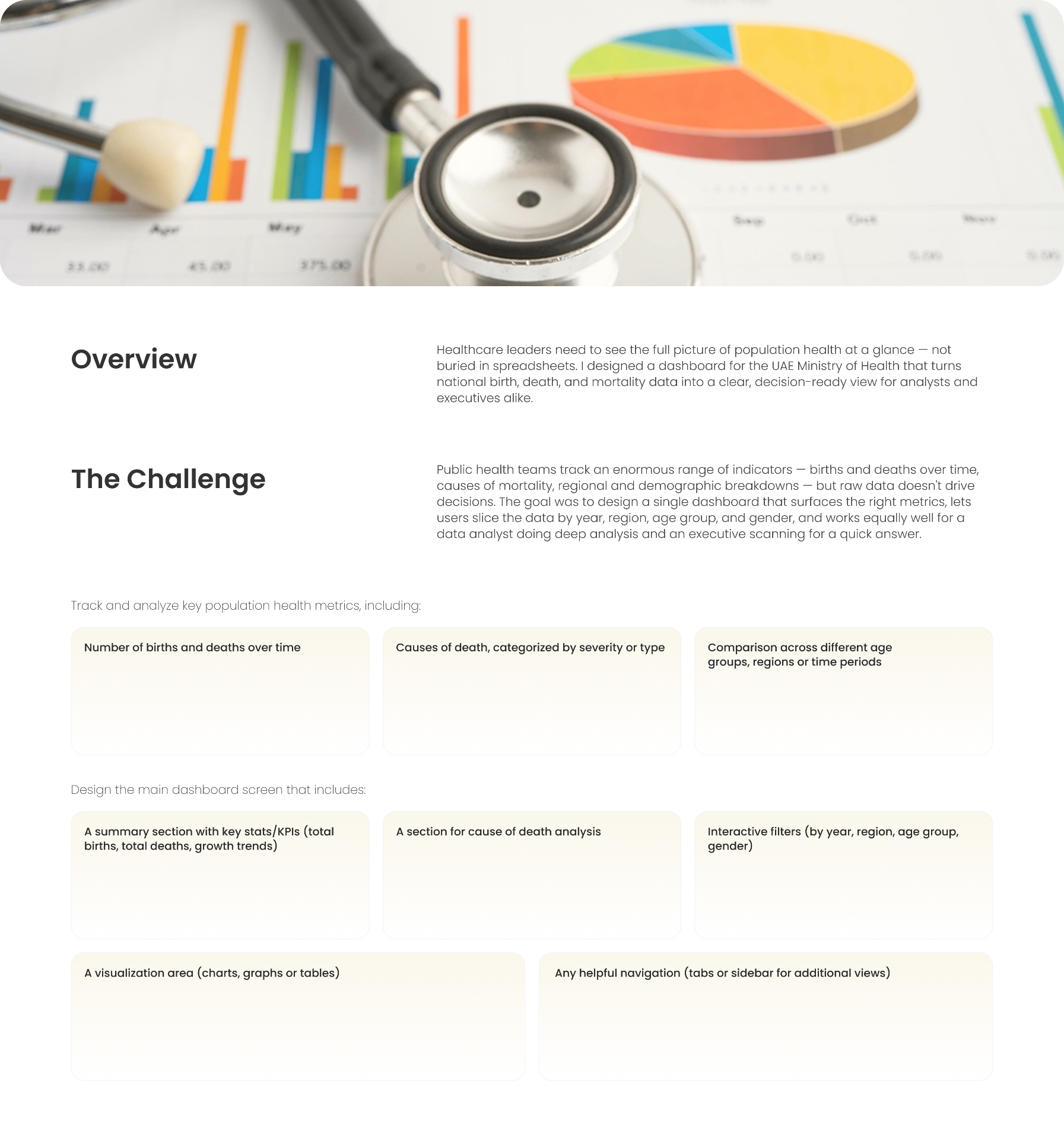
Healthcare leaders need to see the full picture of population health at a glance — not buried in spreadsheets. I designed a dashboard for the UAE Ministry of Health that turns national birth, death, and mortality data into a clear, decision-ready view for analysts and executives alike.

01 · Overview

One screen, national health in focus.

Public health teams track an enormous range of indicators — births and deaths over time, causes of mortality, regional and demographic breakdowns — but raw data doesn't drive decisions. The goal was to design a single dashboard that surfaces the right metrics, lets users slice the data by year, region, age group and gender, and works equally well for a data analyst doing deep analysis and an executive scanning for a quick answer.
02 · The brief

Track and analyse the metrics that matter.

The dashboard had to cover the vital signs of a nation — not as a report, but as an interactive surface.

Births & deaths over time

Longitudinal view of vital events with year-over-year comparisons and trend lines.

Causes of death

Categorised by severity and type — chronic, infectious, injuries, accidents — with share and delta.

Cohort comparisons

Compare across age groups, regions and time periods without leaving the page.

03 · Main dashboard requirements

A single canvas built around five surfaces.

KPI summary

Total births, total deaths, population growth and life expectancy with vs-last-year deltas.

Cause of death analysis

A donut of the year's leading causes with counts and share, ranked and colour-coded.

Interactive filters

Slice by year, region, age group and gender — filters persist across every chart on the page.

Visualisation area

Line, bar and table views for trend, regional and age-cohort breakdowns.

Helpful navigation

A left sidebar (Home, Org Chart, Actions, Reports, Notifications, Settings) keeps deeper views one click away.

The original brief — the metrics and screens the dashboard had to answer for.

04 · Discovery & research

Two users, one dashboard.

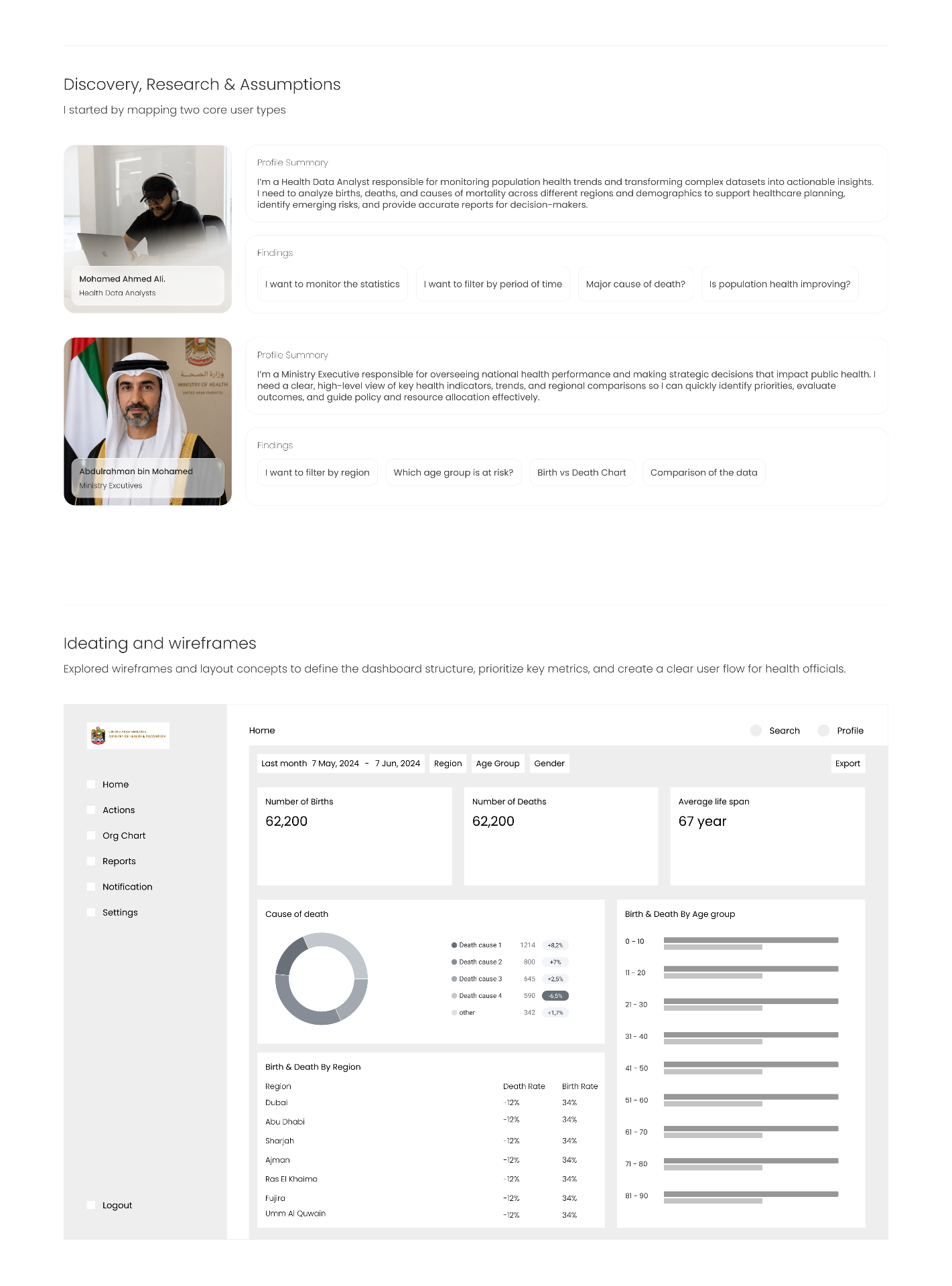
I started by mapping two core user types — a Health Data Analyst who needs to interrogate the data, and a Ministry Executive who needs the answer without the interrogation. Every layout decision that followed had to serve both without compromising either.

Health Data Analyst — Mohamed Ahmed Ali

Monitors population health trends and turns complex datasets into actionable insights. Wants to filter by period, drill into causes and answer: is population health improving?

Ministry Executive — Abdulrahman bin Mohamed

Oversees national health performance and makes strategic decisions. Wants a clear high-level view, regional comparisons and at-risk cohorts to guide policy and resource allocation.

Personas, findings and wireframes — the structural bet before pixels.

05 · Design system

A calm, executive palette with a gold hero.

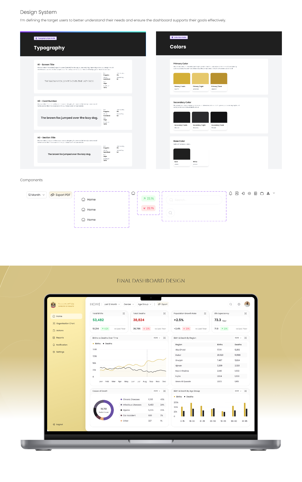
The visual system is built around a warm gold primary — a nod to UAE state identity — paired with a near-black secondary and a light cream base. Typography uses Poppins across screen title (H1 32px), card number (H2 24px SemiBold) and section title (H3), so a scanning executive and a deep-diving analyst read the same hierarchy.

Typography, colour tokens, components — and the final dashboard applied.

06 · Final dashboard

The full picture, one screen deep.

The home screen leads with four KPI cards (Total Births 53,482 · Total Deaths 38,824 · Population Growth Rate +2.5% · Life Expectancy 73.3 years) each with a vs-last-year delta. Below, a Births vs Deaths time series sits next to a regional breakdown table covering all seven emirates. A Cause of Death donut and a Birth & Death by Age Group bar chart close the page — every chart obeys the same year / region / age / gender filters at the top.

Final dashboard — KPIs, trend, regional table, cause donut and age cohorts on one canvas.

Screens

01 · click to expand

Outcome

A decision-ready national health dashboard that serves analysts and executives from the same screen — clear KPIs, filterable trends, regional and cohort breakdowns, all in a gold-and-cream system tuned for the Ministry of Health.

Global reach

Shipped with teams across seven countries.

  • Egypt flagEgypt
  • Saudi Arabia flagSaudi Arabia
  • UAE flagUAE
  • Bahrain flagBahrain
  • Belgium flagBelgium
  • Türkiye flagTürkiye
  • Germany flagGermany